news
reading time: 5 minutes
Iconography
Icons help us navigate quickly, as they are language-independent. And best of all: they're tiny, so they don't take up much space.
Iconography is a visual language. Icons are meant to be simple, visual elements that are recognized and understood immediately. They represent an object, action, or idea and are meant to be read at a glance when placed in a meaningful environment. They have a functional objective – to be recognized immediately and effortlessly – whilst maintaining an essential balance of synthesis and aesthetics as well. Icons help us navigate quickly, as they are language-independent. And best of all: they're tiny, so they don't take up much space. Icons are a fundamental part of a good design system and are very helpful for marketing materials. They are illustrated content, but are also highly technical.

Defining iconography
Before we kick off, it’s worth diving into some terminology. The word „icon” originates from the Greek eikon, which means 'image' and 'clue.' „Icon” is also a generic term that can be broken down further into the definitions of pictograms and ideograms. These are all basically visual metaphors that enhance the speed of comprehension..
iconography
reading time: 5 minutes
news
2022.12.10.
Icons help us navigate quickly, as they are language-independent. And best of all: they're tiny, so they don't take up much space.
Iconography is a visual language. Icons are meant to be simple, visual elements that are recognized and understood immediately. They represent an object, action, or idea and are meant to be read at a glance when placed in a meaningful environment. They have a functional objective – to be recognized immediately and effortlessly – whilst maintaining an essential balance of synthesis and aesthetics as well.
Icons help us navigate quickly, as they are language-independent. And best of all: they're tiny, so they don't take up much space. Icons are a fundamental part of a good design system and are very helpful for marketing materials. They are illustrated content, but are also highly technical.

Defining iconography
Before we kick off, it’s worth diving into some terminology. The word „icon” originates from the Greek eikon, which means 'image' and 'clue.' „Icon” is also a generic term that can be broken down further into the definitions of pictograms and ideograms. These are all basically visual metaphors that enhance the speed of comprehension.
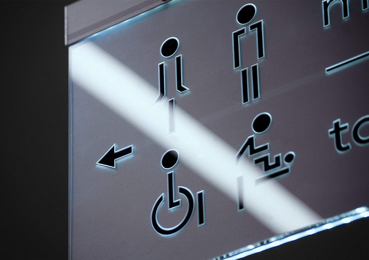
Pictograms or pictographs are pictures that closely resemble what they signify. In this case, the metaphor is literal. Common examples include the telephone icon for public phones, the airplane road sign for an upcoming airport, or a picture of a woman on a door representing the women’s restroom. Material Design’s alarm icon represents a classical mechanical alarm clock with bells. Sometimes the metaphor is a bit outdated, but understandable through repeated use, such as the floppy disk icon to indicate a save action.
Pictograms or pictographs are pictures that closely resemble what they signify. In this case, the metaphor is literal. Common examples include the telephone icon for public phones, the airplane road sign for an upcoming airport, or a picture of a woman on a door representing the women’s restroom. Material Design’s alarm icon represents a classical mechanical alarm clock with bells. Sometimes the metaphor is a bit outdated, but understandable through repeated use, such as the floppy disk icon to indicate a save action.

Ideograms are symbols that represent ideas, meaning they don’t closely resemble a tangible object. Therefore, the meanings of ideograms need to be more widely agreed upon for universal meaning. For example, an eight on its side represents “infinity”, and the shuffle and refresh interface icons communicate their abstract meaning through the movement of arrows. The command icon helps us access shortcuts from a Mac keyboard – but does it reference anything? This symbol was designed by Susan Kare (more on her later) for the Apple’s early OS – in Nordic countries, the symbol, also known as the Gorgon loop, indicates a place of interest, and bears an eerie resemblance to the turrets of a castle. These are all now universally accepted ideograms.
Ideograms are symbols that represent ideas, meaning they don’t closely resemble a tangible object. Therefore, the meanings of ideograms need to be more widely agreed upon for universal meaning. For example, an eight on its side represents “infinity”, and the shuffle and refresh interface icons communicate their abstract meaning through the movement of arrows. The command icon helps us access shortcuts from a Mac keyboard – but does it reference anything? This symbol was designed by Susan Kare (more on her later) for the Apple’s early OS – in Nordic countries, the symbol, also known as the Gorgon loop, indicates a place of interest, and bears an eerie resemblance to the turrets of a castle. These are all now universally accepted ideograms.
The evolution of icon design
Humans have always communicated using symbols and pictures, long before the use of any written language. Pictorial symbols are at the core of Egyptian hieroglyphs, Chinese characters and religious iconography. In modern times, icons are well-known in all fields and areas of the world. They appear everywhere—representing functions, features, and even entire applications. We can confidently agree that the visual language of images transcends every boundary. But when did icons begin to be utilized in the capactity that we are familiar with them today? In the 1930s, economist and social scientist Otto Neurath commissioned the graphic artist Gerd Arntz to develop Isotype, the International System OF TYpographic Picture Education. In addition to the acronym, the word Isotype is Greek for ‘the same sign’. The creation of Isotypes was born from Neurath’s belief that the world needed a unified, international visual language to support (but not replace) each of the world’s spoken languages. The Isotypes visual dictionary consisted of over 4000 symbols designed by Arntz. One of the other earliest examples of pictogram use in design was in 1936, by a man named George Dow. Dow was an employee of the London and North Eastern Railway (LNER) and was instrumental in the development of modern transit maps. Dow’s work inspired the London Tube map created by Harry Beck, now a gold standard in map design. While icons were quickly incoprorated everywhere in the physical world, their impacts in the digital world turned out to be truly remarkable. A pioneer of this practice was the aforementioned Susan Kare, who created the original set of icons for the original Apple Macintosh. Considered one of the most significant iconographers, Kare’s design philosophy is one that signaled the transfer of ideas from off-screen iconography to its on-screen forms.


A powerful tool
Because they are a powerful tool for visual communication, icons can be used in various systems and wayfinding: in building signage, museums, airports, and many other corporate applications. They are also applied in media and infographics, in user interface design, in mobile devices, in digital spaces everywhere.
Icons are found everywhere, because they: help us navigate, warn us, trigger actions, and show status. From an experience standpoint, iconography is used to speed up understanding and reduce cognitive load on the user.
From a design and creative view, iconography is great fun. Well executed icons achieve a balance in functionality, sophistication and artistry.
In many cases, there are already standard icons for devices. Users of a particular platform are typically already accustomed to and understand these standard icons. Standard icon sets only go so far, however. For instance, if you are building a new app or website, you may also need a unique set of icons to represent functionality that the standard sets cannot accommodate without creating ambiguity for the user.
If you are organizing a festival, you might want the wayfinding to be functional but reflective of your atmosphere. If you find you need to create and use custom icons, there a number of design guide points to keep in mind.
A powerful tool
Because they are a powerful tool for visual communication, icons can be used in various systems and wayfinding: in building signage, museums, airports, and many other corporate applications. They are also applied in media and infographics, in user interface design, in mobile devices, in digital spaces everywhere.
Icons are found everywhere, because they: help us navigate, warn us, trigger actions, and show status.
From an experience standpoint, iconography is used to speed up understanding and reduce cognitive load on the user. From a design and creative view, iconography is great fun. Well executed icons achieve a balance in functionality, sophistication and artistry.
In many cases, there are already standard icons for devices. Users of a particular platform are typically already accustomed to and understand these standard icons. Standard icon sets only go so far, however. For instance, if you are building a new app or website, you may also need a unique set of icons to represent functionality that the standard sets cannot accommodate without creating ambiguity for the user.
If you are organizing a festival, you might want the wayfinding to be functional but reflective of your atmosphere. If you find you need to create and use custom icons, there a number of design guide points to keep in mind.


Designing icons
The two most important aspects of designing icons are their style and context. Style means a number of things such as tone of voice, details, perspective, colors, and strokes and fills. This is because in addition to their functional purposes, icons are also emotional, communicating tone and expressing identity. The best brands have a distinct, consistent and intuitive icon style that resonates with their visual identity. They achieve this through a number of design decisions, such as defining an illustrative approach or a limited color palette. Typically, filled icons have higher recognizability, but stroked icons have a larger capacity to house smaller details. Ensuring that enhancements like lighting, shading, gradients, and shadows function coherently with your designs is vital as well. Using lines, colors, textures, forms and space to direct the viewer’s eye while also evoking emotion is the key to great iconography. Whether an icon is meant for digital or physical application, its graphic elements need to work together harmoniously. The trick is not losing impact while adding interest. All of the icons in a set should look as if they were meant to be part of a family, even if some of them are more customized.
Besides style, context is equally important. By context we mean the layout, clarity, sizing and use of grids and placement. Icons gain meaning through context, so their arrangement can make them either more clear or more confusing. Effective icons should be distinguishable at any distance or size. The fundamental building block of this idea is the pixel grid. When building icons, the objects should always align to the grid – in other words, they have to be pixel-perfect. Choose a common size to build all your icons on, then scale down or up as needed. Base product icons might need to work at 24px, but marketing icons might require an 80px grid. Spacing elements evenly is also much easier when using a grid.
Aside from the pixel grid, the optical grid should also be noted. This helps to balance your icons according to perception – for example, circles and curved objects take up less visual space than squares. Once again, consistency is the name of the game – it ensures that each icon has equal weight, equally engaging the users’ eyes.
Final thoughts
Though fluid in meaning and aesthetics, icons remain a time-tested tool. It’s hard to imagine a world without them. At their best, icons read fast, save space, draw attention to important content, and are language-agnostic. Regardless of where and why they are needed, the most important part of creating icons is to design and use them with intention, thought and care.
A brand is an experience that can continuously be shaped and moulded. Studio explicit® creates the essence of the brand together with its Clients, all the while representing timeless design.
location
explicit® is located in the Budapest, Hungary
Studio address: 1067 Csengery Street 71.